

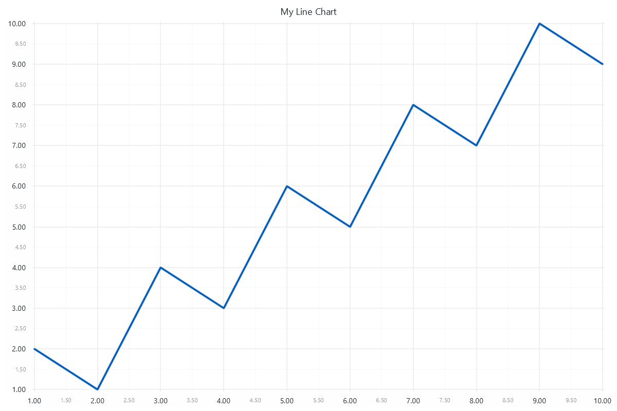
简单折线图
让我们来看一个非常基本的 XY 数据可视化用例,初步了解 LightningChart 的概念。
import lightningchart as lc
lc.set_license('my-license-key')
x = [1, 2, 3, 4, 5, 6, 7, 8, 9, 10]
y = [2, 1, 4, 3, 6, 5, 8, 7, 10, 9]
chart = lc.LineChart(
    title='My Line Chart',
    theme=lc.Themes.White,
)
chart.add(x, y)
chart.open()
使用 lightningchart/lc 引用创建图表。 创建一个 LineChart,并将其引用存储到变量图表中。 在图表构造函数中,定义了标题和视觉主题。 LineChart 是 "声明式 API "图表的示例(请参阅编程 API)。x 和 y 数据点通过 chart.add(x, y) 添加到图表中。 向图表添加数据有多种方法。 最后,通过 chart.open() 打开图表。 有关更多显示选项,请参阅显示图表。
具有多种可视化类型(线形和散点图)的图表
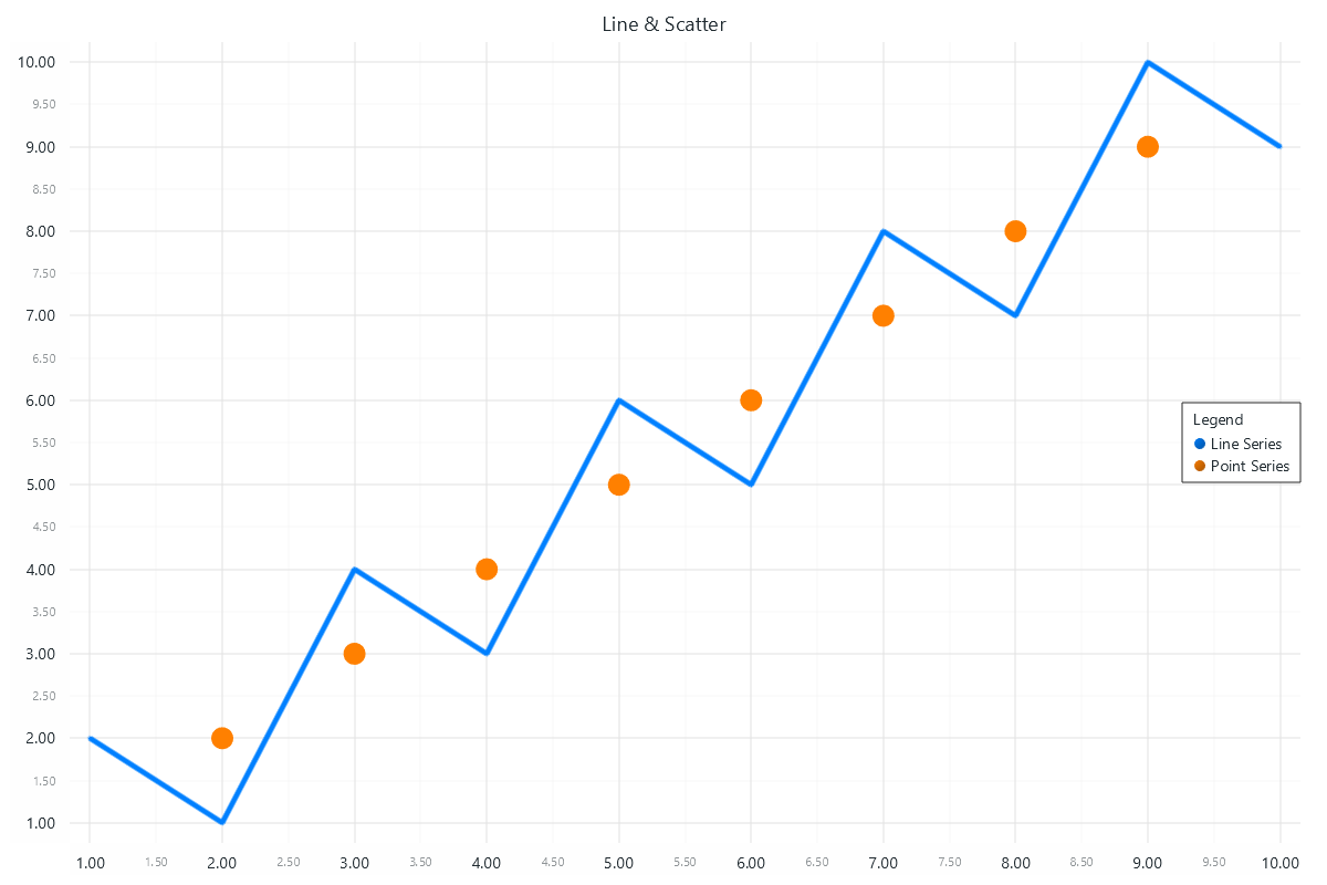
import lightningchart as lc
lc.set_license('my-license-key')
# Two different ways of defining data:
# List of numbers
x = [1, 2, 3, 4, 5, 6, 7, 8, 9, 10]
y = [2, 1, 4, 3, 6, 5, 8, 7, 10, 9]
# List of dictionaries containing number values for x and y keys
scatter_points = [
    {"x": 2, "y": 2},
    {"x": 3, "y": 3},
    {"x": 4, "y": 4},
    {"x": 5, "y": 5},
    {"x": 6, "y": 6},
    {"x": 7, "y": 7},
    {"x": 8, "y": 8},
    {"x": 9, "y": 9},
]
# Initialize the chart
chart = lc.ChartXY(
    title='Line & Scatter',
    theme=lc.Themes.White,
)
# Add a line series to display line
line_series = chart.add_line_series()
line_series.add(x, y)
line_series.set_line_color(lc.Color(0, 128, 255))
line_series.set_line_thickness(5)
# Add a point series to display scatter points
point_series = chart.add_point_series()
point_series.add(scatter_points)
point_series.set_point_color(lc.Color(255, 128, 0))
point_series.set_point_size(20)
# Add a legend to the chart (optional)
legend = chart.add_legend(data=chart)
# Display the chart
chart.open()
有关可用图表的列表,请参阅图表。


 渝公网安备50010702505508